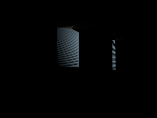
Above I have added some secondary lighting to the scene. The blue light is created using a spot light with and area light attached to it so that the edges are softer and have a nicer drop off. This technique needs some tweaking as it is still not quite right and there is not a lot of opportunity for interesting light streaks to be created by the venetian blinds. On the other hand I do not want too much secondary light that it becomes distracting. (I have to remember that this secondary light will be animated to give the illusion of activity outside the apartment).
Here I created a spotlight and enabled mental ray. I then went into the mental ray attributes and attached an area light to introduce some softness to the light. I then enabled depth map shadows instead of ray trace shadows. This render is much better however the drop off still needs to be increased as I feel that the light streaks are still too sharp.
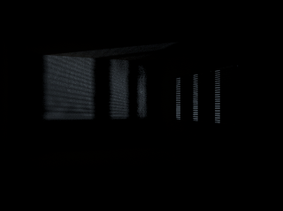
I altered the direction of the spotlight so that not so much light is projected into the room. I also introduced some ray trace shadows to soften the sharp light streaks in the previous image. This render did not turn out too well as the light streaks seem lost. Even increasing the shadow samples did not make any difference.
These following render tests above show how I was experimenting with a couple of different lights and techniques to introduce an exterior secondary light that shall be coming through the venetian blinds. Initially I used a spot light and gave it a light blue tint. The edges here are far too dark so I shall introduce some ray trace shadows. I feel that too much secondary light is coming in to the room here and is far too distracting and the light is casting unrealistic sharp light with no drop off. On the positive side there are some nice light streaks that have been projected on the walls.
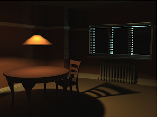
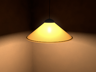
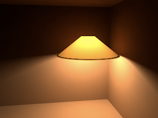
The render above is extremely promising and encouraging. This a rough interior environment layout where I have incorporated all the different techniques I have learnt so far. I am very pleased with this render, the lighting here is close to what I had imagined. Above is a similar apartment layout to the previous render, however the lighting technique is different and in my opinion far more effective. Although it is not so obvious I did also apply a (mib shadow transparency shader) from the mental ray nodes under shadow shaders to the lamp shade lambert. This allows the lamp shade to cast shadows that are not so dark and corresponds to the colour of the lamp shade. This is how I achieved that nice glow effect that is slightly visible to the left of the image upon the wall where the trim is slightly illuminated. However this effect may be enhanced if the light was moved closer to the wall.
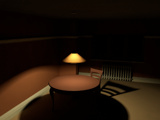
I really like the lighting here as not all of the room is completely visible, however I feel that the room still seems too illuminated. The intensity of the light itself may need to be reduced. I am particularly pleased about the mood that is portrayed within this render. I wanted the lighting to be quite dark yet warm in terms of colour and high in contrast between light and shadow. I gave the light a slight pale yellow tint. I do feel that the shadows need to be softened somewhat as they still seem to be consuming the scene too much. However, this look may add to the sense of mystery and may provide a nice artistic look. The absence of light can in some cases make a shot more interesting and dramatic. Blade Runner is a good example of this in terms of the use of lighting in certain shots.
I then attempted to add some wispy effect to the light fog cone so that it did not appear so uniform. I attempted to use a method used in the tutorial, unfortunately because my light cone is so large adding a volume noise texture to the fog did not work to well and ruins the feel of the scene.
This render is much better. This effect is a good way of suggesting a smokey atmosphere. It may not be essential to the final renders however it was a feature I wanted to learn more about as it had until recently eluded me as to how to use it effectively. I did not really understand how it worked. I discovered using an online tutorial that in order to use this feature you must use depth map shadows instead of ray trace shadows.
Above was my first attempt at using the light fog feature. This did not turn out so well as it is far too intense and there is a horrible shadow cast within the lamp shade. The light fog is also casting a very sharp light cone on the walls. I will look at a tutorial to rectify this.
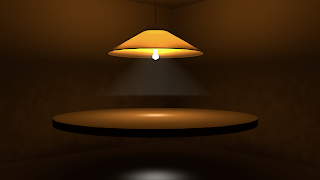
Above is a render where I inserted the bulb and its glow within the lamp shade. It may look slightly better if the Out Glow Colour is reduced because at the moment the glow is far too intense and distracting and seems to be penetrating the lamp shade giving a very unrealistic look. Lowering the intensity may be a good way of giving the suggestion of a bulb within. This added effect may be unnecessary however as the inner glow without the addition of the bulb glow is still quite effective. The addition of a bulb may cause the light to become distracting.
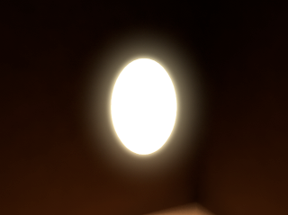
Through a different digital tutors tutorial I learnt how to create a glow effect using a very simple method. I made a polygon primitives sphere and stretched/ elongated it slightly. I then applied a surface shader to this model which can be found near the very bottom of the Maya Surface Shaders. I double clicked on the Surface Shader and increased the Out Colour to white to make it incandescent. I then increased its Out Glow Colour slightly to introduce a nice glow effect. This method can be an effective technique to create a light glow effect on a bulb. This could be inserted within the lamp shade to give a suggestion of a bulb.
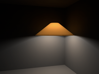
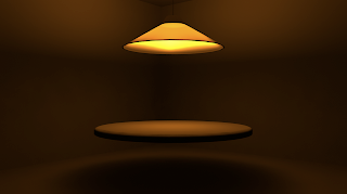
Here I increased intensity very slightly and decreased the translucence focus so that more of the inner glow is allowed to penetrate through the lamp shade.
The render above demonstrates where I have been adjusting some settings. I have reduced the light intensity so the light levels are far more appropriate to portray the desired mood and atmosphere. I have also tweaked the translucent focus by firstly by increasing it by 200. This render in my opinion is slightly too dim.
This image is a much better in my opinion. I have given the walls a warm beige colour. The intensity of the light could be reduced a little as it seems too bright.
Here I have changed the default lambert surface shader to a red clay colour to get more of an idea of what the interior may look like when colour is introduced. The intensity is the same along with the other attributes. Overall it is a nice image, however by doing this I discovered that lighting is also strongly dependent on the choice of colour. The colour of the light is still white however the light cast on the wall appears more orange. I have to bear this in mind for future renders. The lighting here is particularly effective. I really like the soft shadows that are created by the lamp shade upon the wall. There is also a very nice glow effect on the walls where they are closest to the light source. The lambert applied to the walls may be a little too red, but I do like the warmth of these colours in this image. Red could be used to symbolise that there is blood on his hands or that this warmth comes from Frank's love for Rachel.
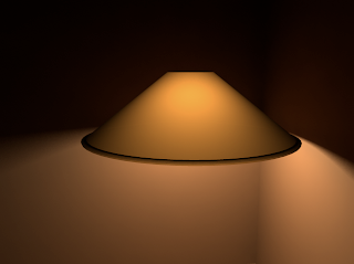
In this render I increased the intensity to 5 and set the decay rate of the area light to linear to get a slightly more realistic lighting effect. Linear basically adds more realism by making the light itself die off faster than the default setting, which is why I had to compensate by increasing the intensity. However the intensity may be a little too strong here. I adjusted the translucence depth to a higher value in order to allow more light to pass through the lamp shade lambert. I also adjusted the translucence focus in order to get the light emitted from the spherical area light to be directed towards the camera. I am trying to get the light glow within the lamp shade that is oriented closest to the camera to be more intense and the outer glow to become more diffused the further it is from the camera. I have realised that lighting changes from scene to scene due to the differences in scale, I shall remember this for when I am creating the final scene set-up.
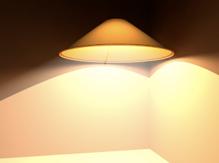
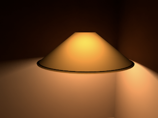
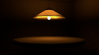
Now it is just a case of tweaking the settings to get the desired look that I want. I firstly applied more of a warm yellow/ orange colour to the lamp shade lambert so that its colour is closer to that of the lamp shade in the initial concept illustration. I also increased the translucence by 150. This render was very encouraging as already the lighting here is taking shape. I really like the inner glow effect toward the top of the lamp where it is closer to the bulb. The lambert itself does look a little flat however so I will have to apply some sort of fabric texture later.
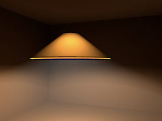
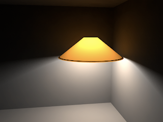
 I am applying what I learn in the lighting tutorial to my own lighting setup. Following the tutorial I have used an area light and enabled the use of mental ray. This allowed me to go into the mental ray tab in the light attributes and use light shape in order to change the shape of the area light from a rectangle/ square to a sphere so that light can be emitted in all directions. This way the area light behaves more like a light bulb. I have used an area light because they are far more effective at producing some very nice yet softer, more realistic shadows. Here I have not changed the colour of the light itself although I have increased its intensity to 2, I have also enabled ray trace shadows so that realistic soft shadows are cast. I have given the lamp shade some colour to test the outcome and most importantly I have altered the properties and attributes of the lambert applied to the lamp shade. (I have used a lambert because there are no reflections which is a wise choice for mimicking a fabric texture). I have enabled some transparency to the lambert surface shader, a value of .010. There must be a value higher than 0 to enable a translucent and inner glow effect to be present. I have also increased the translucence of the lambert by a significant value between 6oo and 800.
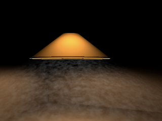
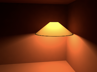
I have looked at an interesting tutorial on the digital tutors website which discusses the use of an area light and the translucence attribute within Maya. This tutorial may prove to be an effective method of recreating an effective light source and mimicking the properties of a translucent lamp shade. The image above shows a simple light setup. In the image there are two area lights present although one may be enough. I have constructed a very basic interior environment to see how the light is cast upon the walls in close proximity to the light itself.
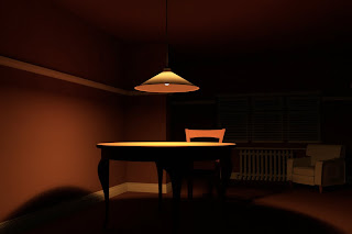
Above is a test render of the apartment room interior, so the settings were generally low. Thus the quality is not as good as it could be. All of the crucial furnishings are in place with simple blinn shaders applied to them. I wanted to get a rough idea of what the apartment interior would look like with colour textures and lighting. This test was a pleasant surprise. Although it is by no means perfect it provides me with a good idea of what the final result may look like. This render also gave me confidence that if done well the final result should look impressive. An occlusion pass I believe will make this render look even better because it will add depth and surface shadows to the surfaces within the apartment.
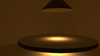
The most important issue at the moment with this render is the lighting. It is not quite right as the table shadow is far to harsh and distracting. This could probably be softened by adjusting the Accuracy and Point density in the Mental Ray settings tab. The suspended table lamp in this particular render in my opinion does not look good enough. I shall see if I can look at some digital tutor tutorials online which may help to get a better lighting setup. All in all however I am pleased because we have a representation so very early in production which demonstrates what I intend the final result to look like. The very essence of my animation short is depicted within this image.
Above is a light test where I attempted to get a subtle light ray effect emitted from the lamp. Here I was experimenting with Light Fog. It is very similar to a regular spot light in terms of function and appearance, however the settings are completely different. The light ray is clearly visible above as it creates a triangle of light, however for some reason the light ray is cut abruptly before it reaches the table surface creating an ugly seem line. The light fog attribute has also created an unwanted acute spot of light on the table top. In addition the light has managed to completely penetrate the table surface.It was incredibly tricky to use and I never really understood how to make it work properly. I will have to look at a tutorial for more details on this light fog effect.
Above is another render of the same setup. I was attempting to make the edges and the overall quality much sharper within the render. I had a feeling that perhaps the incandescent light bulb was causing the problems or maybe it was due to poor topology in the models. A fellow student however explained that I should adjust the Accuracy and Point density settings within the mental ray/ final gather tab. I increased the Accuracy by 200 and the Point density to 2. The render time was increased, however the quality was greatly improved. The shadows seemed softer and the distortions disappeared.
Below are a series of images showing my development by creating a simple lighting setup. I was learning as I went and was discovering which techniques worked well.
The image above was the render I was most pleased with. Here I added an ambient light between the lamp and the table. This provided more illumination within the scene so that the room and its surfaces are visible. It is by not the standard I am looking for but it is close and the colours are correct. Some refinement is required and attributes need a bit of tweaking as there seems to be some odd distortion on the walls. Some additional lights may need to be added to the scene.
What is interesting is that this render consists of basic models which do not even have a texture applied to them. They are simply default lamberts. This demonstrates how lighting is so important even within a 3D program. So perhaps textures are not always necessary. Perhaps all that is needed for a believable render is good lighting in conjunction with a few render passes.
I was pleased with this render. Adding colour to the lights really brought it to life. I was glad that the lighting here is starting to resemble the lighting in my concept illustration. I think the scene here is still too dark and needs an ambient light to introduce more light to the scene.
This render was the first real render that demonstrated that I was getting somewhere. This is the sort of mood and lighting Im looking for. Adding the light cable, the lamp shade top and the shade base rim gave it more detail, and resembles the design of the lamp in my concept illustration.
In this render I applied a slightly translucent lambert texture to the lamp shade and brought the bulb down a bit so that it was slightly more visible. The bulb however is a little over exposed and needs to be toned down a bit using the intensity settings.
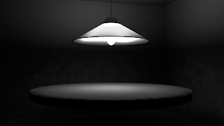
This was the first render I did using an area light as well as an incandesent lambert texture on a crude bulb model. As you can see it works a lot better. It still needs work but the mood is there. I was rendering in black and white so that I could focus on the lighting setup rather than worrying about colour for the time being.
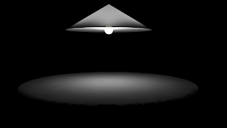
The render above was one of the first tests I did. As you can see it didn't turn out well at all. Here I used a spotlight. For some reason light went through the table and the cone of the spot light is invisible. The colours are wrong too and the cone radius of the spot light is far too narrow.
Below are a couple of videos on youtube which I used. These tutorials focus on lighting techniques.
Choice of Colours, Mood and Sybolism
My concept illustration above demonstrates the lighting and mood I want within the scene. I want the mood to be somewhat somber, to suggest Frank's turmoil within himself and his arching sense of guilt and regret. The warmth (orange) of the suspended overhead table lamp symbolizes Frank's inner sensitive nature. The exterior light (blue) that penetrates the venetian blinds represent the cold nature of his "profession". I wish to demonstrate Frank's character through the use of mood/ atmosphere and lighting.

 The image above is where I have used a spot light and set the penumbra angle to 20 once more. I also enable the ray-trace shadows option. However with mental ray enabled I can now use the area light attribute. This means that in conjunction with the penumbra angle I can have more control on the drop-off of the shadow, thus making the shadow softer. This is a useful technique for lighting a scene so that the shadows are not so intense. The image above is not exactly perfect as there are noise distortions near the edge of the shadows cast, this can be improved by increasing the Accuracy, Point Density and Point Interpolation attributes in the Final Gather tab within Mental Ray . These shadows are far nicer however as they are softer and more diffused.


